My Choice
Brand IdentityMy Choice is a comprehensive initiative that advocates for legal and safe abortions for individuals across America. The organization recognizes the importance of individual experiences and circumstances and seeks to create a dynamic and inclusive brand identity that reflects this diversity.
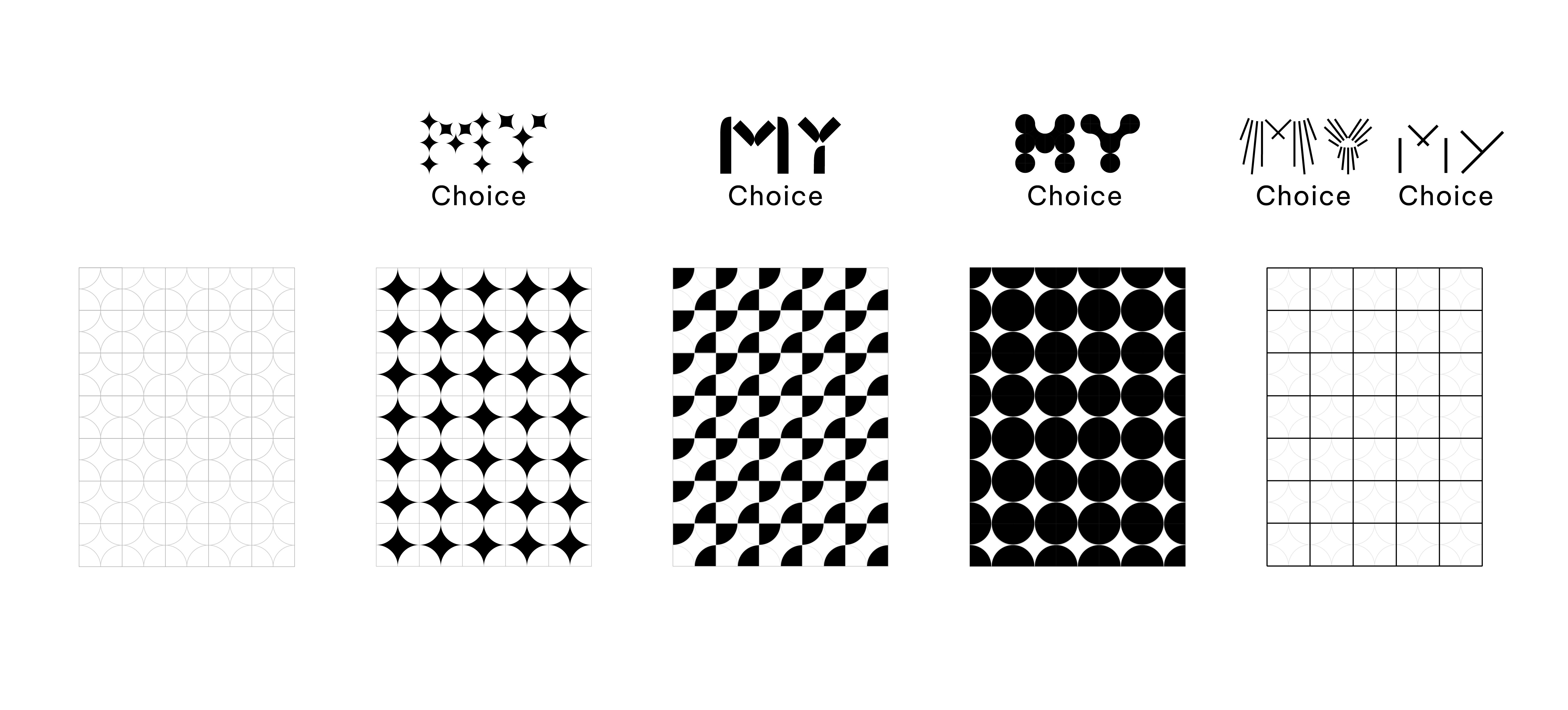
By breaking away from static logos, the dynamic and evolving logotype represents the fluidity of personal decisions and the importance of respecting individual autonomy. ‘My’ adapts to different contexts, while ‘Choice’ remains constant.
The interplay of bold and energetic colors is intended to counteract the prevailing stigmas associated with discussions around abortion and reproductive rights. This approach fosters an environment where open dialogue and understanding can thrive, providing individuals with a positive community where their voices are heard and respected.
Through this dynamic branding approach, My Choice is dedicated to building a future that challenges stigmas and supports legal and safe abortions for everyone, everywhere.


